Floral Harmony Made Simple
The foundation of compelling floral composition begins with color literacy rooted in the traditional color wheel. This circular system organizes hues into a structured relationship where red, blue, and yellow serve as primary anchors.
From these, secondary tones emerge through mixing—orange, green, and violet—while further blending produces tertiary shades that introduce subtle variation and complexity. However, the true strength of the color wheel is not in isolated hues but in how they interact.
When opposite tones are paired, such as blue with orange or red with green, the result is a complementary contrast that heightens visual intensity. In contrast, neighboring hues like teal, green, and chartreuse form an analogous grouping that feels naturally cohesive and visually smooth. A triadic arrangement, using three evenly spaced colors such as red, yellow, and blue, creates a structured yet energetic balance that avoids visual monotony.
Related
 Deserts get less than 10 inches of rain a year — yet certain plants there store thousands of gallons of water. Here's how.
 Plants can't run from the wind — so they evolved something far more interesting: they literally reshape themselves in response to it.
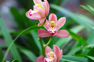 Orchids don't just attract insects — they manipulate, deceive, and trap them. Here's how this elaborate system actually works.
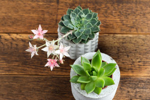 Discover how small plants can bring calm, beauty, and a refreshing vibe to even the tiniest living spaces
 How connecting habitats helps animals thrive and survive
 Easy Tips to Make Aloe Thrive, Fill Your Garden, and Bloom Within a Year
Seasonal Palettes and Contextual Expression
Natural cycles offer a constantly shifting palette that influences visual composition strategies. Spring tends to introduce soft gradients—dusty pinks, pale lilacs, and light sky tones—mirroring renewal and organic expansion. Early seasonal blooms such as tulip varieties, hyacinth clusters, and daffodil forms often reinforce this gentle tonal language.
Summer shifts dramatically toward saturation and brightness. Intense yellows, fiery reds, and vivid coral tones echo longer daylight exposure and heightened natural energy. Species such as sunflower heads, zinnia clusters, and marigold structures naturally amplify this visual warmth, creating arrangements that feel expansive and expressive.
Autumn introduces a transition into deeper chromatic density. Burnt sienna, rust, amber, and burgundy reflect environmental transformation as foliage matures and decays. Dahlias, chrysanthemums, and asters are frequently associated with this period due to their layered petal structures and rich tonal variability.
Winter, by contrast, often favors restraint. Frost-inspired whites, muted greens, and cool blues evoke stillness and clarity. Evergreens, pale rose varieties, and seasonal poinsettia forms create compositions that emphasize minimalism and negative space, reflecting the quietness of colder environments.

Thematic Composition and Cultural Context
Beyond seasonal influence, thematic intention plays a defining role in color selection. For ceremonial contexts such as weddings, restrained palettes using ivory, blush, and soft tones create a sense of refined elegance. In contrast, more contemporary styling may incorporate unexpected accents such as slate blue or deep burgundy to introduce visual tension without disrupting harmony.
Corporate environments often rely on structured neutrality, combining muted bases with controlled accent tones aligned with branding identities. This ensures visual professionalism while still allowing expressive detail. Holiday-focused arrangements adopt culturally recognized palettes—deep green and red for winter festivities, pastel combinations for spring celebrations—each carrying symbolic resonance tied to collective memory.
Modern composition trends increasingly blend tradition with unconventional pairings. For instance, pairing classic white blooms with sculptural succulents or integrating darker, unconventional hues into ceremonial designs reflects a shift toward individualized expression rather than formulaic styling.
Balancing Visual Weight and Color Intensity
Achieving equilibrium between bold and subdued tones requires careful control of visual hierarchy. Strong chromatic elements—such as crimson, burnt orange, or deep violet—naturally draw attention and often function as focal anchors. These are typically positioned at central or elevated points within the composition to establish structure.
To prevent visual overload, softer tones like lavender, blush pink, and cream are distributed around these focal areas. Their role is not secondary but supportive, allowing transitions between intense color zones while maintaining flow. This layering technique ensures that no single hue dominates the entire visual field.
Greenery and neutral elements contribute essential stabilizing effects. Fern-like textures, eucalyptus branches, and ivy forms create spatial breathing room, allowing saturated tones to appear more pronounced by contrast. Neutral fillers such as off-white or beige act as visual buffers, preventing abrupt chromatic clashes.
Texture, Form, and Spatial Depth
Color alone doesn't define visual success; surface variation and structural contrast greatly enhance perception. Soft, rounded blooms contrast sharply with architectural forms like protea, creating dimensional tension within a composition.
Vertical elements, including delphinium spikes or gladiolus stems, introduce directional movement that guides the viewer’s eye upward. In contrast, compact blooms such as hydrangea heads or rose formations stabilize the visual base, ensuring structural grounding. Foliage diversity further amplifies tactile richness. Velvety lamb’s ear introduces softness, while eucalyptus contributes both silvery tone and aromatic presence. Fine filler elements, including baby’s breath or astilbe clusters, soften transitions between dominant forms and prevent harsh visual segmentation.
Different stylistic intentions benefit from distinct textural approaches. Naturalistic arrangements often incorporate irregular spacing and mixed species to emulate organic growth patterns. Minimalist compositions, however, rely on controlled spacing and sculptural clarity, emphasizing form over abundance.

A well-composed arrangement is not simply a collection of colors and shapes but a carefully constructed visual language that communicates mood, context, and intention. When color relationships, seasonal awareness, structural balance, and textural diversity are thoughtfully integrated, the result becomes more than decorative—it becomes expressive and immersive. Each composition ultimately invites interpretation, encouraging viewers to engage not only with what is seen, but with what is felt beneath the surface of color and form.