Choose Paint Colors Smartly
Most people choose wall paint colors by staring at swatches under the fluorescent lights of a paint store and picking whatever seems least terrifying.
Then they get home, roll it on, and discover it looks completely different in their actual light with their actual furniture.
There's a better approach — and it starts with understanding how colors actually work on the brain and in different spaces.

Colors Aren't Just Aesthetic, They're Functional
Different colors reliably produce different emotional and behavioral responses. Blues tend to feel calm and focused — which is why they work particularly well in bedrooms and home offices. Greens promote harmony and are easy to live with over time, making them solid choices for social spaces like living rooms and dining areas.
Related
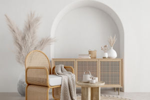
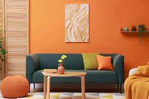
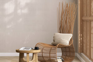 A calm living room comes together with wicker lounge seating, raw wood, soft texture, and less clutter
 Want a Taller Ceiling Without Renovation? The Secret Is Low Furniture and Visual Balance.
 Why do so many people love gardening? The answer may surprise more than expected!
 Want a Calm and Timeless Home? These Wabi-Sabi Furniture Ideas Can Transform Any Living Space Naturally!
 What Sofa Color Fits Your Home Best? Simple Rules, Matching Methods, and Popular Shades Explained for a Stylish Living Room!
 Create a modern living room that feels stylish, comfortable, and timeless
Yellows are energizing and light-reflecting, ideal for hallways or kitchens that lack natural light. Reds stimulate appetite and conversation — historically popular in dining rooms for that exact reason.
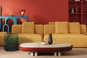
The 60-30-10 Rule
Interior designers often work with the 60-30-10 principle: 60% of the room in a dominant color (usually the walls), 30% in a secondary color (typically the larger furniture pieces), and 10% as an accent (cushions, artwork, accessories). This proportion creates a cohesive room that has both depth and balance. It's also a useful framework when you're not sure whether a color combination will work — if it satisfies all three levels, it almost always does.
Light Changes Everything
The same paint color can look completely different under morning light, afternoon sun, and evening lamp. A warm beige can turn distinctly orange under incandescent bulbs. A cool gray can shift to a noticeable purple in north-facing light. Always test colors on the actual wall — a large patch, at least the size of a sheet of paper — and observe it at multiple times of day before committing. Paint stores' lighting and your home's lighting are rarely the same.
Don't Be Afraid of Dark Colors
Dark walls are intimidating but often deeply effective. A charcoal or navy wall creates a sense of intimacy and sophistication that light colors simply can't achieve. In a small room, a dark color well chosen doesn't necessarily make the space feel smaller — it can actually make it feel more defined and intentional. The key is making sure the room has enough light sources to prevent the space from feeling closed in.

Start Small If You're Unsure
If committing to a full wall feels like too much, introduce a color through accent pieces first — cushions, a throw, a vase, a piece of art. This lets you live with the tone before it covers a wall. If the color still feels right after a few weeks, the step up to painting is a much less risky decision. And if it doesn't feel right, you've spent almost nothing finding that out.